Pecha Kucha link
The Meaning and Hidden Representation of David Gilhooly’s Artwork
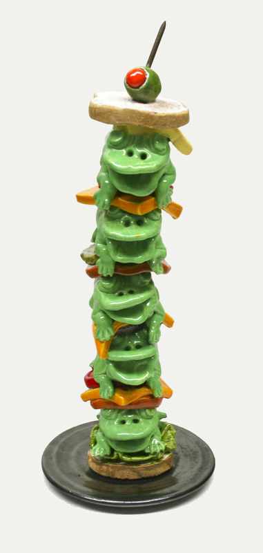
This artwork was made in 1991 by David Gilhooly and it is 20in x 8in x 8in. This piece is five frogs stacked together in a sandwich with cheese, tomatoes, lettuce, and pickles in between them. There is a slice of bread on the bottom and the top. There is a green olive with a toothpick on the top bun, and all of this is placed nicely on a perfect wheel thrown platter. The colors on this piece are very bright, especially on the frogs. All of the frogs are a pretty bright green with no other colors on them, and the wheel thrown platter is black. It is leaning slightly to the right, and each frog has two nostrils and a big open mouth.
Almost everything David Gilhooly makes is frogs inside of items of food, and frogs are very gross and slimy, so I think all of those pieces represent today’s food and how everyone is eating more and more unhealthy food. If I made this artwork I would name it “What Lies Under the Bun” because of what I think it represents. If not that, I would name it “Frog Sandwich”, “Today’s Food”, or “What you Can’t See”. I think David Gilhooly made this to inform or even warn everyone about all the unhealthy food in the world.
This artwork contains a wide variety of bright and colorful colors. The frogs are a very pretty bright green, which makes this artwork look especially appealing and attractive. The cheese is yellow, the lettuce is green, the tomatoes are red, the pickles are green and white, the bread is brown and white, and the olive is green and red. All of the frogs are unique and have lots of character. Green is used the most in this artwork. It is on the frogs, the lettuce, the pickles, and the olive. I think the frogs are the most important thing about this piece because they are the most visible and the bright green attracts your eyes. I think he started with the wheel thrown platter and made his way to the top until he reached the toothpick.
Overall, I really love this piece. The use of colors is amazing, making this piece look very nice, the hidden representation is very complex, which makes you really think, and the simplicity of this piece makes it really easy to look at and enjoy. The only thing I don’t like about this piece is that the platter is black, causing it to be the only non colorful item in this piece. I would suggest this piece to someone else because I think anyone would like it. So, next time you come across an artwork that looks simple and plain, really think about it. Try to find the meaning behind it. Try to figure out why the artist really made it. Then and only then will you understand the depth and intelligence of true art.
